ERP Viewer

Diving into the world of Neuroscience and Autism at the Yale Child Studies Center, I created this web app to display Event Related Potentials, or ERPs. ERPs are a method of analyzing Electroencephalogram (EEG) data by averaging many examples of someone’s brain reacting to the same stimulus. EEG, in case you’re unfamiliar, is electric potentials recorded from the scalp, and one of the cheapest and easiest ways of seeing what a brain is up to.
Built with Mathbox and javascript, this visualization aims to both provide a comprehensive look at an ERP, and also allow for comparison between two ERPs. Naturally, there are many more specific ways of comparing ERPs, but sometimes its nice to just have something visual and interactive. The same goes for looking at an ERP, of course. Plots of voltage are often limited to a single channel, or lose accuracy by trying to show all channels at once. With 124 channels of data, it’s difficult to find any one channel in such a “butterfly” plot.
This visualization isn’t perfect, naturally, but it does provide a very intuitive and easy(er) way of taking in the data. Especially if you’re less familiar with EEG data. Besides, I’m of the opinion that it looks more impressive this way, and quite pretty as well. As with all things, presentation can go a long ways towards making things easier to understand and more compelling.
Here’s what you are looking at (below):
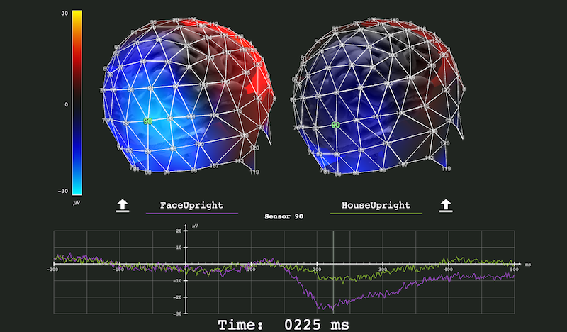
The main attraction is comprised of two brain models, with two “nets” over them, which can be rotated by clicking and dragging. The electric potential is visualized as color across the surface of the nets. Time loops through the bounds of a single trial, and is displayed at the very bottom of the visualization. In the lower half you will find a plot which can display an individual channel, which you can select by double-clicking.
The specific ERP you are viewing is showcasing a common feature called the N170, short for a Negative peak at ~170ms after stimulus in the rear, right-hand side of the brain. In the case of the stimulus being a face (left, purple), the N170 has a stronger peak compared to when the stimulus is a house (right, green). The difference is strongest in the area around electrode 90.
If you happen to have a plain-text ERP from a Geodesic 128 channel net lying around, you can try loading them into the app with the buttons on either side. Rows should be channels, and columns time.