US Storms Since 1996

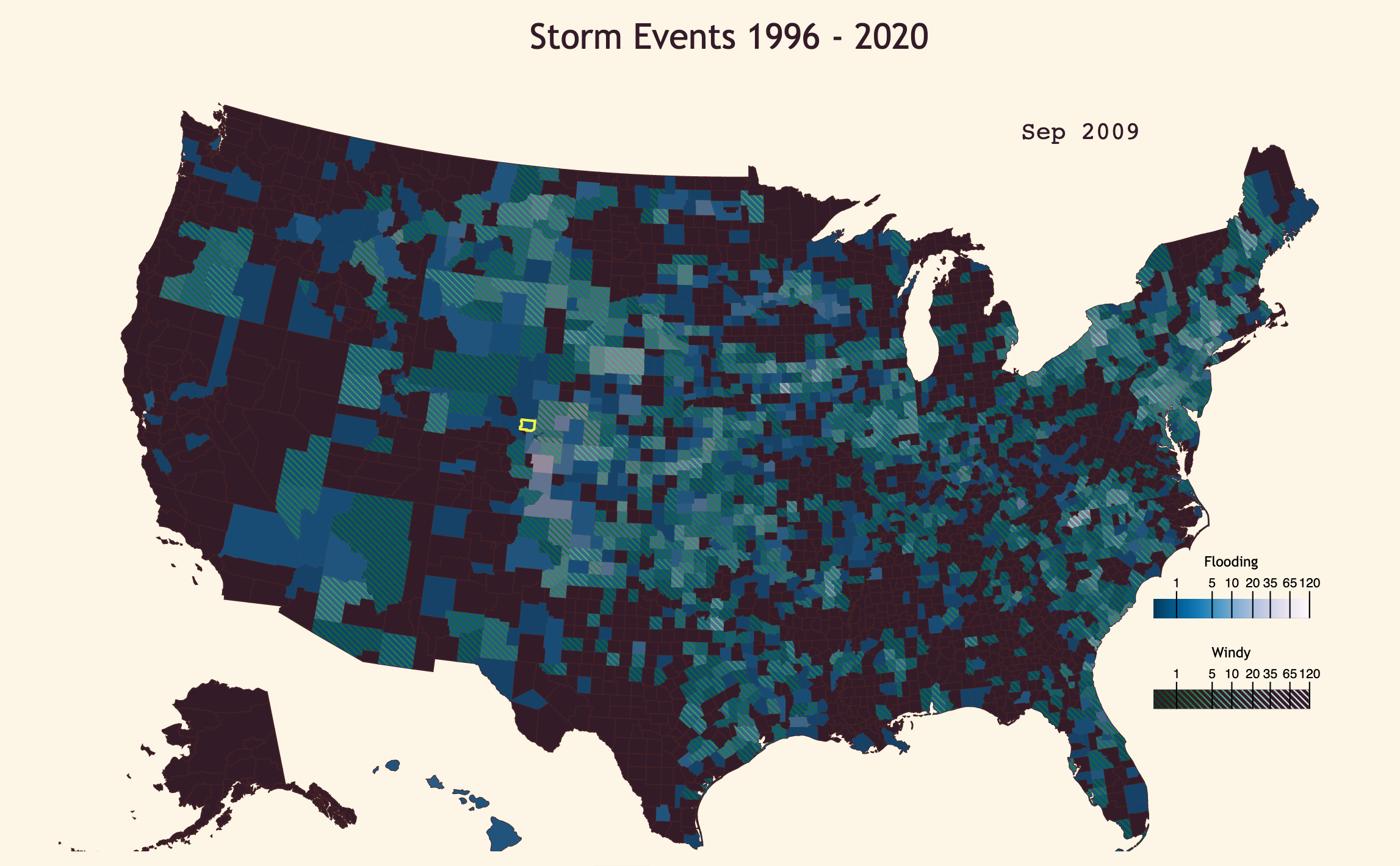
Drawing from the Storm Events database from the National Weather service, I set out to visualize a simple aspect of the data: how many storms in certain categories (involving flooding or high winds) happened in each county every month? For this, I utilized D3 and TopoJSON, as well as Webpack and Babel for development.
The resulting visualization came out fairly well, with regards to how closely it resembled my initial vision. Sadly, using overlapping patterns was not as clear and readable as I was hoping it might be. The map becomes somewhat muddied at times, even with just solid colors and a single patterned overlay. Originally I was planning on 3 patterned overlays over the background, but that would obviously have been too much. Two competing patterns didn’t work out so well either, leading to the less exciting but function choice of solid colors to display occurances of flooding.
Interactivity wound up much as I was intending, allowing users to click on a single county to examine its data, and to click on the secondary line plot to display a set point in time. Dragging the time around the map is satisfying, though it is slower with the current rendering load. During development, when I had only one layer of counties changing colors, the plot was able to keep up with no problems at all. With two sets of overlays, I was definitely pushing SVG into realms it wasn’t really intended for. I have read that Canvas might perform a bit better, and I’ve no doubt a WebGL version could perform much better. But that’s a project for another time.
There are a number of areas that I would like to improve, but I was fairly pleased with the end result. The largest flaws are the load time, since the data are large and take time to load, and the rendering load. Which will cause the app to slow down on machines that weren’t meant to render thousands of SVG paths. The first flaw is fixable in several ways. One is simply to chop up the data file into smaller chunks, and load them one at a time, displaying what we’ve already loaded as we go. Another is compressing the file, which would considerably reduce the data transfer necessary, but then require decompression on the client side.
At the end of the day, thoguh, it’s still an interesting visualization. Some things that might stand out to you include the jump in floods (or more likely, flood record keeping), around 2006. There’s a marked difference in the wind-dominant records before this time, compared to the watery blues we find after. The earliest data points, going back to 1950, were all tornados that caused considerable damage. One imagines that over the years, the government has started tracking more types of events, as well as expanding the coverage of events, regardless of severity in damage. Though, I will note that I filter the data to only visualize storms that had caused some damage, whether to people or their crops and property.
Some counties are suspiciously devoid of any records, particularly in Alaska. This may well be due to my above filtering (which I currently defend as saving me from an even larger data file to load at the start). But the filtering obviously skews the data in favor of highly populated areas.
Of course, I’ve barely touched the surface of this database. It’s huge, for one thing, and I didn’t even end up using my “Icy Storms” category that I computed. Since the charts are fairly reusable, I may end up creating more of these, looking at narrower pieces of the data. As well as making improvements as I go along, naturally.
If you’d like to examine the data yourself, you can do so HERE.